Data displays in the VIP Dashboard
Data displays are provided in several panels of the VIP Dashboard including Insights & Metrics, Usage, and Defensive Mode. Users can review, filter, and interact with the data using a shared set of symbols and tools that are built into the framework of the user interface (UI).
Note
All timestamps are formatted in Coordinated Universal Time (UTC).
Display data for a specific time period
The available periods of time that can be selected differs between production environments and non-production environments.
- Production environments: Data from the “Last 3 days” (72 hours) is displayed by default, and data is available for up to the “Last 90 days”.
- Non-production environments: Data from the “Last 60 minutes” is displayed by default, and data is available for up to the “Last 24 hours”.
Historic data up to 180 days can be accessed by configuring a custom date range in the datepicker dropdown.
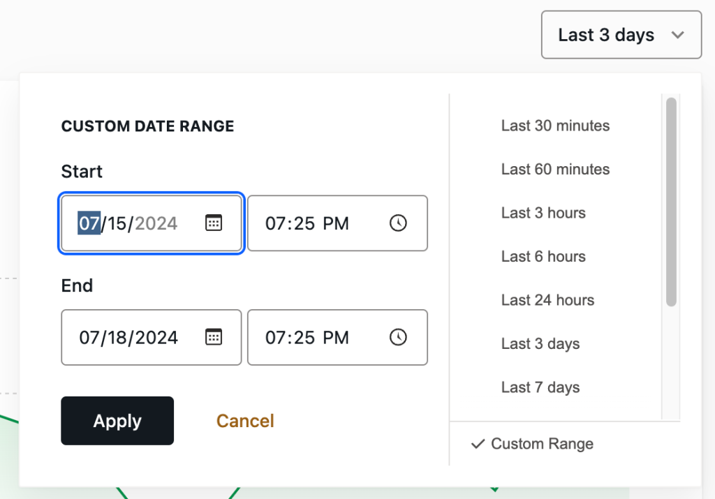
Datepicker time selection
A user can select a preset list of time periods or enter custom time periods for environment data in a datepicker. To access the datepicker, select the field in the upper right of the panel that displays timestamps for the date range of the currently displayed data.
For example, a user can select from a displayed list of preset windows of time for the “Last 30 minutes”, or up to the “Last 90 days” for a production environment.
More specific periods of time can be selected by entering dates in the fields labeled “Start” and “End” in the section of the datepicker labeled “Custom Date Range“. The range of data displayed can be further specified by entering times (in UTC) for dates entered. Select the button labeled “Apply” to save the settings and refresh the displayed data.
Manual time selection
As an alternative to the datepicker, if data is displayed in chart format a time range can be manually selected. Using a mouse, select a timestamp within the x-axis of the chart. Hold the mouse button down while dragging across to a second timestamp along the x-axis, and release the mouse button. The data displayed within the chart will refresh and display only the data that exists within the first and second timestamps that were selected.

Note
Manual time selection is not currently an option for charts in the Usage panel.
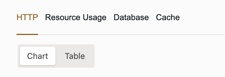
Display data as a chart or a table
Data can be displayed in either a chart format (default) or a table format. To toggle between formats, select either the button labeled “Chart” or “Table” at the upper left of the VIP Dashboard panel.
Share and export data
Each chart and table displayed in a VIP Dashboard panel can be shared with other people who have sufficient access permissions for that application.
- Copy Link: A direct link to a specific chart or table in a VIP Dashboard panel can be added to a user’s clipboard by selecting the button labeled “Copy Link” for that chart or table.
- Export as CSV: The data behind a specific chart and table in a VIP Dashboard panel can be exported as a CSV file by selecting the button labeled “Export as CSV”. The exported data will match the data within the selected date range of that chart or table at the time the file was exported.

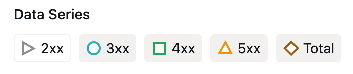
Data Series
When data is displayed in chart format, a legend for the different types of data that is displayed is located at the bottom left of the chart. The legend provides a reference for identifying the types of data that are included in the chart, as well as providing the ability to toggle those data types on and off.
For example, in an “HTTP Origin Response Codes” chart a Data Series legend item has a green square to the left of “2xx”. This indicates that data in the chart represented by a green line correlates with “2xx” responses.
The user can select and toggle a Data Series legend item to omit or include its correlating data in the chart.
The icon for a displayed data type has a colored outline, and an omitted data type has a grey outline.
Event Types
Prerequisites
To access Event Types in a VIP Dashboard panel, a user must have at minimum an Org member role or an App write role for that application.
Events that occur on an environment and might correlate with changes in the displayed data are indicated by Event Types.
Event Types can include:
- Code deployments
- Data syncs from production to non-production environments (only indicated in graphs within the Insights & Metrics tab labeled “Database” for non-production environments)
- Software version updates
- SQL database file imports (only indicated in graphs within the Insights & Metrics tab labeled “Database”)
- Performance metrics anomalies (including User-Defined Thresholds for anomalies)
Table format
When data is displayed in table format, Event Types that occur within a selected date range will be displayed in the column labeled “Events“. The displayed Event Type is hyperlinked and can be selected to access more information about the event in a related VIP Dashboard panel.
Chart format
When data is displayed in chart format, a user can select an Event Type icon to access more information about the event. Selecting an Event Type reveals the event’s date, timestamp, and description, and a link to more detailed information. For example:
- Code deployment events are represented by a capital “D” within a blue circle.
- Software version update events are represented by a capital “U” within a green circle.
- SQL database import events are represented by a capital “I” within an orange circle.
- Data sync events are represented by a capital “S” within an orange circle.
Legend
If Event Types occur within the range of time that is currently displayed in a chart format, a legend for those Event Types will be located below the chart along with the number of those events displayed within the selected time range. A user can select and toggle an Event Type in the legend in order to omit or include them within the chart.

Last updated: January 21, 2026